Heritage paint colours are carefully curated palettes that reflect the tones originally used on Australian homes from the Victorian, Federation, and Edwardian periods. Dulux and Taubmans both offer dedicated heritage ranges with colours like Brunswick green, Indian red, heritage cream, and stone buff. After fifty years of painting homes across Orange, Bathurst, Millthorpe, and Carcoar, I have worked with nearly every shade in these ranges, and I can tell you which ones hold up and which ones cause headaches.
Picking the right heritage colour is not just about looks. It is about choosing a shade that suits the architecture, meets any local heritage guidelines, and actually performs in the climate we deal with here in the Central West. At 862 metres elevation, with frost for five to eight months of the year and summer temperatures pushing past 35 degrees, the wrong colour choice can fade, chalk, or look completely wrong within a couple of years.
What Makes a Paint Colour "Heritage"
Heritage colours are not simply old-fashioned shades pulled from a history book. Both Dulux and Taubmans have spent years researching original paint samples scraped from historic Australian buildings, matching those pigments to modern formulations that actually last. The result is a set of colours that look period-correct but perform to modern standards.
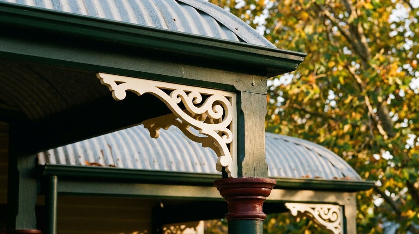
Walk through Millthorpe, where the entire town centre is National Trust classified, and you will see heritage colours done properly. The deep greens on the shopfronts, the warm creams on the rendered walls, the subtle stone tones on the cottages. Those colours were not picked at random. They reflect what was actually used in the 1860s through to the early 1900s, and they work because they suit the materials and the light.
Heritage colours generally fall into a few families:
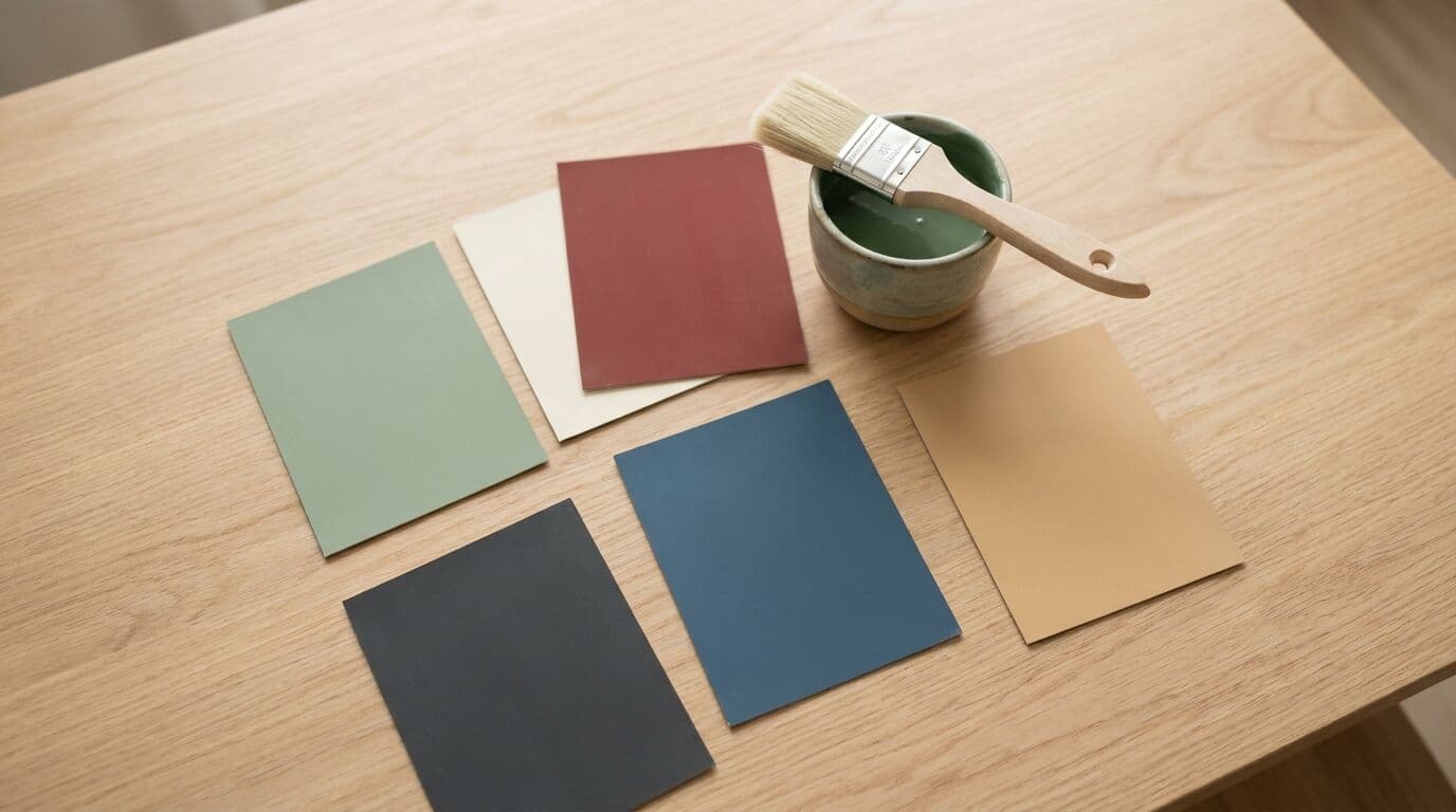
- Creams and buffs: Warm, earthy whites that sit between yellow and beige. These were the most common wall colours across all heritage periods. Dulux Antique White U.S.A. and Dulux Hog Bristle are modern versions that capture this tone beautifully.
- Deep greens: Brunswick green and similar shades were used on doors, window frames, and verandah posts throughout the Victorian and Federation eras. Taubmans Mid Bristol Green is a good match for this.
- Indian reds and oxide tones: These earthy reds were used extensively on metalwork, verandah floors, and as feature colours. They are still one of the most requested heritage shades I apply.
- Stone and grey tones: Subtle, grounding colours used on rendered walls and plinths. Dulux Grey Stone and Taubmans Woolstone Grey are both excellent choices.
- Dark blues and charcoals: Used more sparingly on doors and trim, particularly in the later Federation and Edwardian periods.
The Dulux Traditional Colour Range
Dulux offers what they call the Traditional Colour Chart, which is their most relevant range for heritage work in Australia. This is a curated selection from their broader palette, specifically chosen to complement older architectural styles. It includes colours that meet heritage overlay requirements in many council areas.
Some of the Dulux colours I use most often on heritage homes around Orange and Bathurst include:
- Antique White U.S.A.: The classic heritage cream. I have probably used more tins of this than any other single colour in my career. It works on rendered walls, weatherboard, and as a trim colour alongside darker features.
- Hog Bristle (Half): A warmer, slightly richer cream that suits homes where pure white would look too harsh. Excellent for weatherboard cottages.
- Shetland Lace: A soft neutral with a gentle pink undertone. Pairs well with charcoal trims and works nicely on Federation homes with detailed fretwork.
- Italian Clay and Evening Blush: Warmer accent tones that work well on feature walls and verandah details.
- Casper White Quarter and White On White: Softer whites for trim and ceilings that do not look stark against heritage body colours.
Dulux also offers the Weathershield range in these heritage colours, which is what I recommend for exteriors. In our climate, with UV levels that are genuinely punishing in summer and then frost cycles cracking substandard films through winter, you need a paint system that can flex and breathe. Dulux Weathershield with a proper preparation system gives you 15 years of confidence on a well-prepared surface.
The Taubmans Heritage Options
Taubmans takes a slightly different approach. Rather than a single branded heritage collection, they offer heritage-appropriate colours across their Endure and All Weather ranges. The advantage is that you get durable exterior formulations in colours that councils and heritage advisors accept.
Colours like Taubmans Mitchell Brown, Woolstone Grey, Kirribilli, and Mid Bristol Green are all part of palettes frequently referenced in heritage guidelines across regional NSW. If your home is in a heritage conservation area, your council may have a specific list of approved colours, and Taubmans shades appear on many of those lists alongside Dulux.
I find Taubmans performs well and is competitively priced. For a standard four-bedroom weatherboard home, the difference between Dulux and Taubmans heritage colours might be $200 to $400 in paint cost alone. Both deliver good results when applied properly. The real difference is always in the preparation.
Matching Colours to Your Home's Period
One mistake I see homeowners make is choosing a heritage colour without considering the actual period of their house. A Victorian cottage in Carcoar, with its simple symmetrical facade and bullnose verandah, needs a different palette from a Federation home in Orange with decorative timber fretwork and turned posts.
- Victorian homes (1850s to 1890s): Stick to darker, more muted tones. Deep greens, Indian reds, dark browns, and stone buffs. Walls were often left as face brick or painted in light buff and biscuit shades. Window sashes were typically dark green or dark red.
- Federation homes (1890s to 1915): Slightly lighter overall, with warm creams on walls and bolder accent colours on the decorative timber details. This is where heritage reds, deep greens, and even some muted blues come into play. The fretwork and verandah details were often painted in contrasting colours to highlight the craftsmanship.
- Edwardian homes (1901 to 1918): Similar to Federation but often simpler, with softer colours. Creams, light greys, and white trim became more common. These homes suit colours like Dulux Shetland Lace or Casper White with a heritage green or red on the front door.
In Blayney and the surrounding villages, many homes sit across these periods. I always recommend doing a bit of research into when your house was built before selecting colours. The Orange City Council heritage resources are a good starting point, and your local library can help with historical photographs that show original colour schemes.
Why Preparation Matters More Than the Colour You Pick
I say this in almost every conversation, and I will say it again here. You can pick the most historically accurate heritage colour in the Dulux or Taubmans range, apply it over a surface that has not been properly prepared, and it will look terrible within two years.
Heritage homes present specific preparation challenges. Old lead-based paint layers need to be managed safely. Weatherboard gaps need filling. Rendered surfaces often have hairline cracks that will telegraph through new paint. Timber that has been exposed to fifty Central West winters may have soft spots that need cutting out and replacing before any paint goes near it.
On a typical heritage home in Orange, I budget two to three days of preparation before any finish coats go on. That includes washing, sanding, scraping loose paint, spot priming bare timber with a dedicated primer, filling gaps and cracks, and applying a full coat of Dulux primer-sealer. Only then do we apply two full coats of the finish colour. That is a minimum of four to five days of work for a standard exterior, and it is the only way to get a result that lasts.
For a four-bedroom weatherboard heritage home in the Central West, a full exterior repaint using Dulux heritage colours typically runs between $8,000 and $15,000, depending on the condition of the existing paintwork, the height of the building, and how much timber repair is needed. That price includes all preparation, priming, and two coats of premium exterior paint.
Heritage Colours and Council Requirements
If your home sits within a heritage conservation area, or is individually heritage listed, you may need council approval before changing the exterior colour scheme. This applies to parts of Orange, much of Millthorpe, and virtually all of Carcoar, which has more than thirty heritage-listed buildings packed into its small village.
Council guidelines typically provide a list of approved colours or colour families. They generally require that you use colours appropriate to the period of your home and that the overall scheme does not clash with neighbouring properties. This is not as restrictive as it sounds. Most heritage colour palettes give you thirty to fifty approved shades to work with, and a good colour consultant or experienced painter can help you put together a scheme within those guidelines that still feels fresh and personal.
I have worked with heritage advisors on several council projects, and the process is usually straightforward. Submit your proposed colour scheme with paint swatches, wait for approval, and then proceed. The turnaround is typically two to four weeks.
Climate Considerations for Heritage Colours in the Central West
Dark heritage colours absorb significantly more heat than light ones. On a 38-degree January day in Orange, a wall painted in Brunswick green can reach surface temperatures above 70 degrees Celsius. That puts enormous stress on the paint film and the substrate underneath. Timber expands, paint softens, and over repeated cycles, you get cracking and peeling.
My advice for heritage colours on the Central West tablelands is to keep the darkest shades for small areas, such as doors, window frames, and verandah posts, where they are often shaded by the verandah roof. Use lighter heritage tones on the main wall areas. This is actually consistent with how most heritage homes were originally painted, so you are being both historically accurate and practical.
For north and west facing walls that cop the worst of the afternoon sun, I always recommend Dulux Weathershield or an equivalent UV-resistant system. The extra cost, roughly $10 to $15 per litre more than a standard exterior paint, pays for itself in longevity. You will get an extra three to five years before the next repaint.
Getting Your Heritage Colours Right
Before committing to a colour, always test it on your actual walls. Buy sample pots and paint a one-metre square patch on each elevation of the house. Look at it in morning light, midday sun, and late afternoon. Heritage colours can shift dramatically depending on the light. A cream that looks warm and inviting on the south side can look washed out and yellow on the sunblasted north face.
If you are unsure about colour selection, I am happy to discuss options based on your home's period and style. At Murrays Painting, we work across Orange, Bathurst, Millthorpe, Carcoar, Blayney, and the wider Central West, and we bring decades of experience with heritage properties to every job. Every project is owner-supervised, and we use Dulux products as standard. Get in touch for a free quote, and we can walk through the heritage colour options that will suit your home and last in our climate.