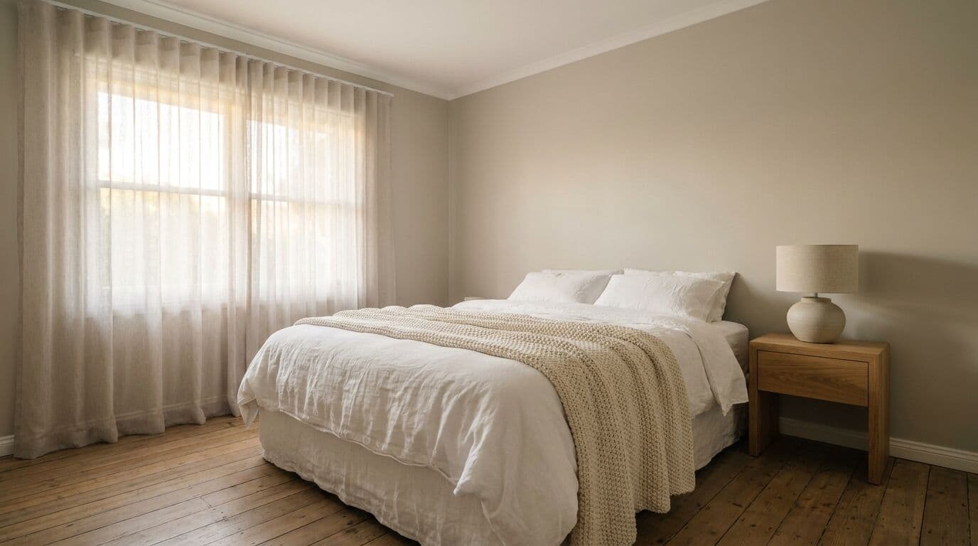
The neutral paint colours that never date are warm whites, soft greiges, and muted stone tones, colours that sit quietly on a wall and let your home do the talking. After fifty-plus years of painting houses across Orange, Bathurst, and the Central West, I can tell you that the homes which still look fresh ten or fifteen years later almost always share one thing in common: their owners chose a timeless neutral and had it applied properly over solid preparation.
Trends come and go. I have painted entire streets in colours that were fashionable for three years and regretted for twenty. A well-chosen neutral does not date, because it was never trendy in the first place.
What Makes a Colour Truly Timeless
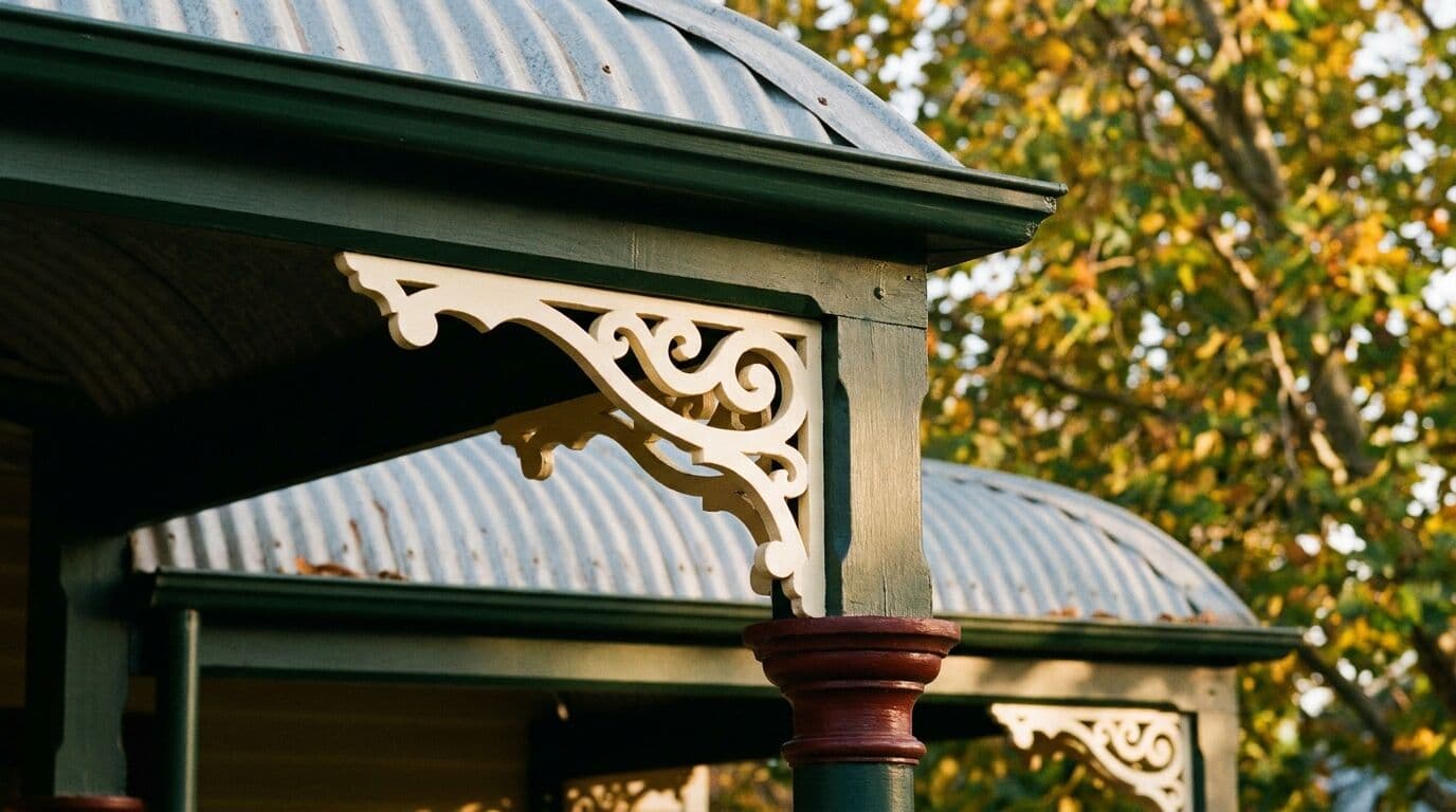
A timeless neutral is not just "safe." It is a colour with enough depth to feel intentional but enough restraint to avoid locking your home into a particular era. Think of the federation cottages in Millthorpe or the heritage terraces in Carcoar. The ones that look best today are wearing the same family of colours they wore decades ago: warm whites, stone, putty, and soft grey-greens.
The key is undertone. Every white, every grey, every beige has a hidden lean towards warm or cool. Get the undertone right for your home and your light, and the colour will look effortless for years. Get it wrong and something will always feel slightly off, even if you cannot put your finger on why.
Here is what I look for in a neutral that will go the distance:
- It works in both summer and winter light. Up here at 862 metres elevation, our light swings from the cool, blue-toned glow of a July frost morning to the harsh, bleaching glare of a 36-degree January afternoon. A good neutral holds its character across both extremes.
- It does not fight the landscape. Our red-ochre soils, eucalyptus greens, and golden paddock grasses are the backdrop to every home in the Central West. A neutral that clashes with those earth tones will always look foreign.
- It ages gracefully. UV at our elevation is relentless. A colour that fades into something muddy or chalky after three summers is not timeless. It is a problem waiting to happen.
The Neutrals I Keep Coming Back To
Over fifty years, certain colours have proven themselves over and over. These are the ones I recommend most often, and the ones I see still looking sharp a decade after we rolled them on.
Warm whites. Not a flat, cold hospital white. Whites with a whisper of warmth. Dulux Natural White is probably the single most-used colour in my career, and for good reason. It reads as clean and fresh without feeling sterile. On a weatherboard cottage in Blayney or a rendered home in Orange, it just works. Dulux Antique White U.S.A. is another classic that has never let anyone down. These whites have enough warmth to feel alive in our cooler winter light, without turning creamy when summer hits.
Greige. The sweet spot between grey and beige, and my go-to recommendation for interiors over the past fifteen years. Dulux Linseed is a beautiful example, warm and earthy without being trendy. It pairs well with white trim and timber floors, and it does not show scuffs the way a pure white wall does. For a family home that needs to look good and handle daily life, greige is hard to beat.
Stone and putty. Slightly deeper than greige, these carry real substance. Think Dulux Smooth Render or Dulux Stonewall. On a solid brick home or a large rendered facade, these tones add warmth without being heavy. They work particularly well around Bathurst and Orange where homes sit on larger blocks with established gardens.
Soft sage and grey-green. These sit on the cooler side of neutral but have earned their place, especially on exteriors. A muted sage on a weatherboard home with cream trim has looked right since the 1920s and still does today. Dulux Pale Eucalypt is one I have used on heritage homes in Carcoar and Millthorpe that still looks perfect years later.
The Colours That Date Fastest
It is just as useful to know what to avoid. In my experience, the colours that date a home most quickly are the ones that feel exciting at the time of choosing.
- Feature wall brights. That burgundy accent wall or electric teal splashback might look striking in a magazine, but it pins your room to a specific moment in time. I have repainted more feature walls than I can count for homeowners preparing to sell.
- Cool greys without warmth. The concrete-grey trend peaked around 2016 to 2019 and already looks tired. Pure cool greys feel cold in our winter light and flat in summer. If you want grey, add some warmth to it.
- Stark brilliant white exteriors. On paper it sounds clean. In reality, at our elevation, brilliant white glares painfully in summer, shows every mark, and turns a dull blue-grey in winter shade. A warm white achieves the same freshness without the harshness.
How to Test a Neutral Properly
Neutrals are the hardest colours to choose from a swatch card. The differences are subtle and your eye can play tricks. I always tell homeowners to invest in sample pots, around $12 to $15 each, and paint patches at least A3 size on the actual wall. Do three or four options.
In Orange, with our dramatic light shifts across the day, you need to check those patches at 8am, midday, and again at 4pm. Do this over two or three days. A neutral that looks perfect in the soft morning light can turn muddy by mid-afternoon, or vice versa. With five to eight months of frost influencing the light for half the year, you want a colour that holds its warmth even on a grey July morning.
Pay attention to what is around the colour, too. Timber floors, a red brick fireplace, green garden views through the windows. All of these bounce reflected colour onto your walls. A neutral with a green undertone next to a lush garden view will amplify that green. Sometimes that is lovely. Sometimes it makes the room feel off.
Preparation Makes the Colour Last
Even the most beautiful neutral will look ordinary if the preparation is not right. On exteriors around the Central West, we deal with frost sitting on surfaces for weeks between May and October, summer UV that breaks down paint films, and temperature swings of 25 degrees in a single day.
Before any topcoat goes on, the surface needs to be cleaned, sanded, filled, and primed. On timber, that means checking for rot. On render, it means repairing cracks that expand and contract with our temperature extremes. On previously painted surfaces, it means removing any flaking or chalking paint back to a sound base.
I supervise every job personally because this preparation stage is where corners get cut on cheaper quotes. You can save $2,000 on a quote and end up repainting in four years instead of twelve. With a quality Dulux system, properly applied over thorough preparation, a good neutral should look fresh for 10 to 15 years on interiors and 7 to 10 years on exteriors in our climate.
Neutrals and Resale Value
If you are thinking about selling, a timeless neutral is the smartest paint investment you can make. Estate agents across Orange and Bathurst will tell you the same thing: a freshly painted home in a clean neutral photographs better, presents better at open inspections, and attracts broader buyer interest. I have seen homes add $15,000 to $30,000 in perceived value from a full interior repaint in a well-chosen neutral, against a typical cost of $8,000 to $18,000. The return is genuine, but only if the colour is right and the finish is professional.
A Simple Palette That Works Every Time
If you want a starting point, here is the palette I recommend more than any other for homes in the Central West:
- Walls: Dulux Natural White or a soft greige like Dulux Linseed.
- Ceilings: Dulux Lexicon Half or Dulux White on White for a clean, bright ceiling that does not yellow.
- Trim and doors: Dulux Vivid White in a semi-gloss for crisp contrast against warm walls.
- Exterior body: Dulux Antique White U.S.A. or a warm stone tone.
- Exterior trim: Dulux Surfmist or a soft white that complements the body colour.
Every home is different, and the light, surroundings, and architecture all influence what works best. But as a starting point, this palette is hard to go wrong with.
If you are choosing colours and want a second opinion from someone who has been doing this for over fifty years, give us a call at Murrays Painting. We offer free quotes across Orange, Bathurst, Millthorpe, Blayney, Carcoar, and the wider Central West. I am happy to look at your home and help you land on a neutral that will still look right long after the latest trends have come and gone.