Choosing the right paint colour for your home comes down to three things: understanding your light, working with your surroundings, and testing properly before committing. After fifty years of painting homes across Orange, Bathurst, and the Central West, I have watched hundreds of homeowners agonise over colour charts only to end up with a result they love, and I have seen a few who wished they had taken a different approach.
Colour is personal, but it is not guesswork. There are practical rules that apply to every home up here on the tablelands. Get these right and your home will look exactly the way you pictured it. Get them wrong and you will be repainting sooner than you planned.
Light at 862 Metres Is Different
One of the first things I tell homeowners in Orange is that light behaves differently up here. At 862 metres elevation, the atmosphere is thinner and the UV is stronger. Colours look more intense in direct sunlight than they do at sea level. That soft grey you fell in love with on a Pinterest board shot in Sydney will look completely different on your weatherboard in Millthorpe.
Our light also changes dramatically across the seasons. In winter, when we are deep into our five to eight months of frost, the light is low, cool, and blue-toned. A warm cream that looks perfect in June can shift yellow and heavy in the harsh December sun when temperatures push past 35 degrees. You need a colour that works in both conditions, and that means testing at different times of day and across at least two or three days.
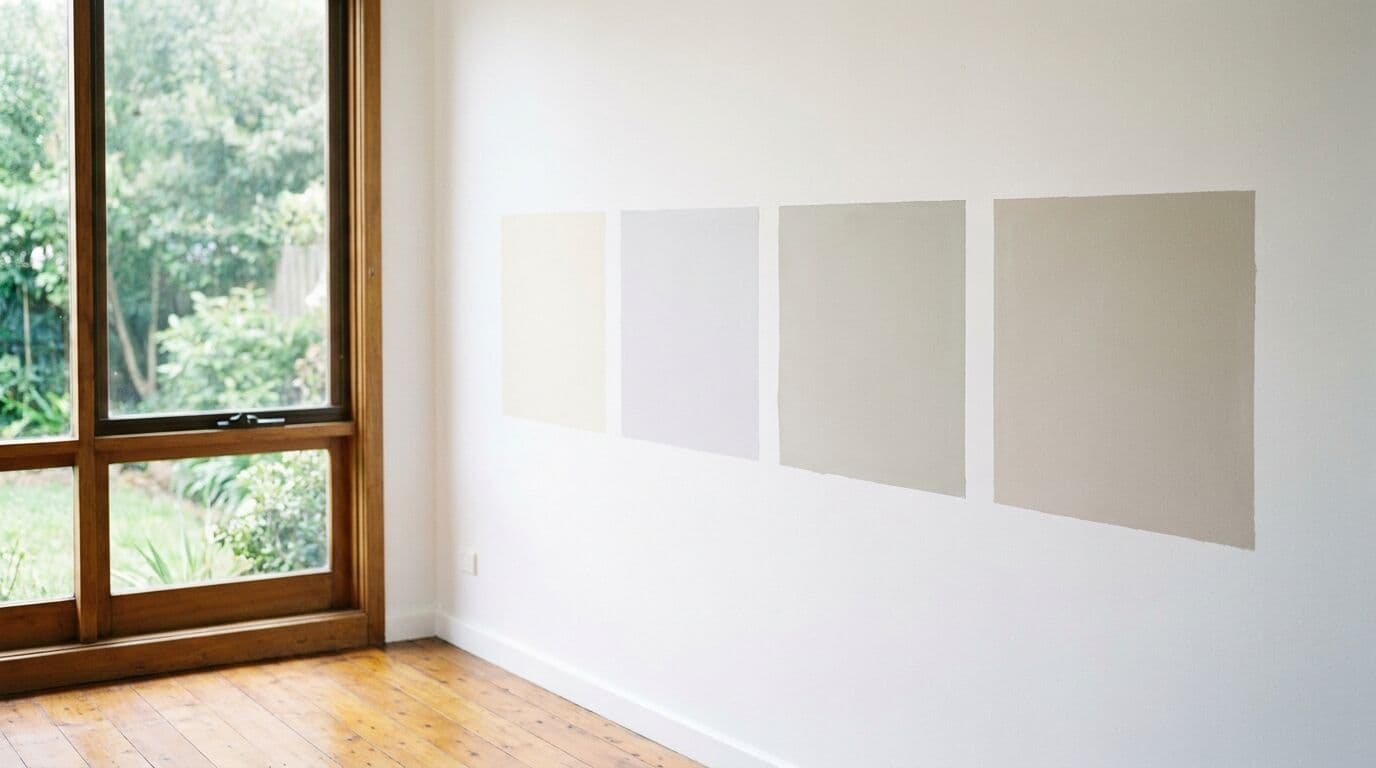
I always recommend painting a sample patch at least A3 size, ideally on the actual wall you are considering. A small swatch card held at arm's length tells you almost nothing. Paint the sample on the north-facing and south-facing walls, then check it at 8am, midday, and 4pm. You will see three different colours, and the one you choose should be the one you are happy with in all three.
Working with Your Surroundings
Paint does not exist in isolation. Your house sits in a landscape, next to other buildings, under a sky that changes hour by hour. In the Central West, we have deep red and ochre soils, eucalyptus greens, and golden grasses for much of the year. These natural tones are worth thinking about when you choose your palette.
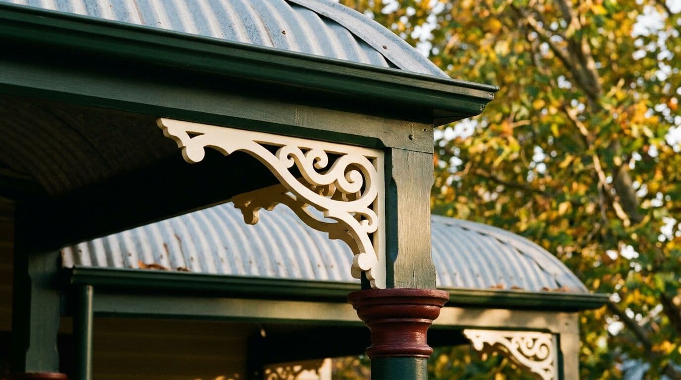
A heritage cottage in Carcoar surrounded by established gardens will suit a very different palette to a new build on the outskirts of Bathurst with an exposed block. In the older villages, heritage colour schemes tend to work best. Think muted greens, warm creams, heritage reds, and deep charcoals for trim. These are not arbitrary choices. They evolved because those colours sit naturally against the landscape and the existing streetscape.
For modern homes in Orange and Blayney, the current trend towards cooler greys and whites can look stunning, but only if you account for the warm, golden light we get for much of the year. A true cool grey can look washed out and almost purple in certain conditions. Adding a touch of warmth, even just shifting from a blue-based grey to a green-based grey, makes a significant difference.
Interior Colour: The Room Matters
Inside your home, the rules shift. Natural light is filtered through windows, and the direction those windows face changes everything. In the Central West, a north-facing living room gets warm, golden light for most of the day. Cool whites and pale blues work beautifully there because the warm light balances them out. A south-facing bedroom, on the other hand, gets flat, cool light that can make those same colours feel cold and clinical. Warmer tones, a soft off-white or a gentle greige, will make that room feel welcoming rather than sterile.
Room size matters too. Darker colours absorb light and make spaces feel smaller and more intimate. That can be exactly what you want in a large open-plan living area, but it can make a small bathroom feel claustrophobic. For smaller rooms, lighter tones open things up. For larger rooms, you have more freedom to experiment with feature walls and deeper shades.
- North-facing rooms: Handle cool and warm tones well. Test in the afternoon when the light is strongest.
- South-facing rooms: Avoid cool whites and greys unless you want a deliberately moody feel. Warm neutrals and soft creams work best.
- East-facing rooms: Beautiful morning light, cooler in the afternoon. Choose colours that look good in both warm and neutral light.
- West-facing rooms: Strong, warm afternoon light. Be careful with warm tones as they can become overwhelming by 4pm in summer.
The Dulux Colour System
We use Dulux exclusively, and there is a good reason for that beyond the quality of the paint itself. Dulux has the most comprehensive colour system in Australia, with over 4,000 colours available. More importantly, their colour tools are genuinely useful.
The Dulux Colour Wall at your local paint supplier is a good starting point, but I recommend going further. Dulux offers A4 colour swatches that you can take home and hold against your walls, your furniture, your flooring. They also have a colour consultation service that can help if you are truly stuck. I have seen it save homeowners weeks of indecision and, on a few occasions, thousands of dollars in repainting costs.
One thing to understand about the Dulux system is that colours are organised into families. If you find a colour you almost love but it is slightly too dark or too warm, look at the colours above and below it on the same strip. They share the same base pigments and will coordinate naturally. This is particularly useful when you are choosing trim, feature walls, and ceiling colours that need to work together without clashing.
Common Mistakes I See
After fifty years, I have seen the same mistakes come up again and again. Here are the ones that cost people the most time and money.
- Choosing from a screen: Phone and computer screens do not reproduce paint colours accurately. A colour that looks perfect on your laptop will look different on your wall. Always work from physical swatches and sample pots.
- Ignoring the undertone: Every white has an undertone. Some lean pink, some lean green, some lean yellow. If you paint your ceiling in a pink-toned white and your walls in a green-toned white, both will look "white" on the chart but the room will feel unsettled. Keep your undertones consistent.
- Matching to a single item: Choosing your wall colour to match a cushion or a piece of art seems logical, but interiors work better with complementary relationships. A colour that sits near your feature piece on the colour wheel, rather than matching it exactly, will make both elements look better.
- Forgetting the ceiling: The ceiling is the largest unbroken surface in any room. Painting it standard flat white when your walls are a warm tone can make the ceiling look grey and dirty by comparison. A quarter-strength version of your wall colour on the ceiling ties the room together beautifully.
- Skipping preparation: This is not strictly about colour, but I mention it because even the perfect colour looks wrong on a poorly prepared surface. Patchy coverage, visible repairs, and uneven sheen all distort how a colour reads. Proper preparation, filling, sanding, priming, and cleaning is what lets the colour do its job.
Exterior Colour and UV Fade
Up here in the Central West, UV exposure is fierce. At our elevation, paint fades faster than it does at sea level, and darker colours fade the most. A deep charcoal feature wall that looks dramatic on day one can look patchy and faded within three to five years if you are using a standard product.
For exterior work, I always recommend Dulux Weathershield or equivalent premium exterior lines that include UV-resistant pigments. The cost difference between a standard exterior paint and a premium UV-resistant product is typically $15 to $25 per litre, but that translates to years of additional life. On a standard three-bedroom home in Orange, the total material cost difference might be $200 to $400, which is negligible compared to the $8,000 to $15,000 cost of a full exterior repaint.
If you love darker colours on your exterior, position them strategically. Use them on south-facing walls and sheltered areas where UV exposure is lower, and use lighter tones on the north and west faces that cop the most sun. This approach gives you the dramatic look you want while managing the practical reality of our climate.
The Value of a Second Opinion
I supervise every job my team does, and that includes the colour discussion. When I walk through a home with a client before quoting, I look at the light, the existing finishes, the architecture, and the landscape. Sometimes a homeowner has already chosen the perfect palette and we are simply confirming it. Other times, a five-minute conversation about undertones or sheen levels saves them from a decision they would have regretted.
Sheen is worth mentioning here because it affects how colour looks just as much as the pigment itself. A matt finish absorbs light and softens colour. A semi-gloss reflects light and intensifies it. The same Dulux colour code in matt and semi-gloss will look like two different colours on your wall. For living areas and bedrooms, a low sheen is usually ideal. For kitchens, bathrooms, and high-traffic areas, a semi-gloss is more practical but expect the colour to read slightly differently.
Getting Started
If you are planning to paint your home in Orange, Bathurst, Millthorpe, Blayney, or anywhere across the Central West, start with the light. Observe your rooms and your exterior walls at different times of day. Narrow your choices to two or three options within the same colour family, then test them with proper sample patches. Take your time. A week spent testing colours before the job starts is worth far more than a week spent regretting a rushed decision afterwards.
Murrays Painting offers free quotes across the Central West, and colour advice is part of that process. With over fifty years of experience painting homes in this region, we know how colours perform in our unique climate, which products hold up best, and how to prepare surfaces so the finished result looks exactly the way you imagined. Give us a call and we will come out and have a look.