The biggest interior colour trends for 2026 in Australian homes are warm earthy neutrals, deep greens, and soft clay tones. After fifty years of painting homes across Orange, Bathurst, and the Central West, I have watched colour trends come and go. But this year feels different. Homeowners are choosing colours that actually suit the landscape around them, not just whatever looked good in a Sydney apartment on Instagram.
Every week I am in someone's lounge room or kitchen helping them pick colours, and the conversations in 2026 have shifted noticeably. People want warmth. They want their homes to feel grounded and calm. After years of cool greys dominating everything, the pendulum has swung, and honestly, it is about time.
Warm Neutrals Are Back, and They Suit Our Region
The biggest shift I am seeing is the move away from stark whites and cool greys toward warm, creamy neutrals. Dulux has reflected this with their 2026 colour forecast leaning heavily into warm undertones. Think soft wheats, warm linens, and gentle sandstone tones rather than the blue-grey that dominated for the past decade.
This makes perfect sense for homes in the Central West. When you look out the window in Orange or Millthorpe, you see golden paddocks, red-brown soil, and sandstone buildings. A warm neutral on your walls connects the inside of your home to the landscape outside. Cool grey never did that. It always felt a bit disconnected up here, even if it looked smart in a Bondi terrace.
Some specific colours I have been recommending and applying this year include Dulux Warm Neutral, Dulux Natural White (which has a gentle warm base), and Dulux Antique White U.S.A. These work beautifully in living areas, hallways, and bedrooms. They also pair well with timber floors and the natural stone features you see in a lot of heritage homes around Carcoar and Millthorpe.
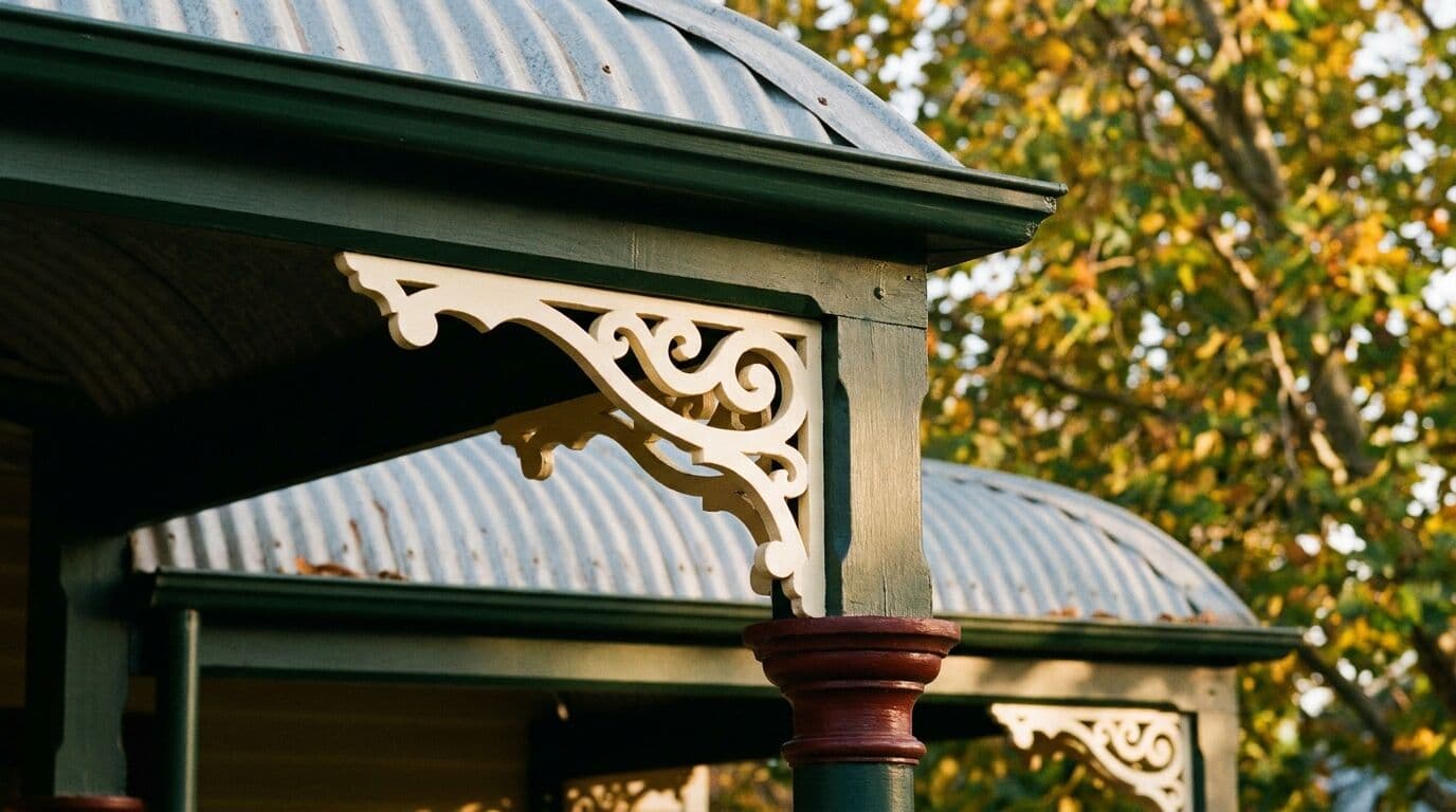
Deep Greens for Feature Walls and Studies
Deep, moody greens are having a genuine moment. Not the bright Kelly greens of the 1990s. I am talking about forest greens, olive tones, and deep sage. Homeowners in Orange and Bathurst are using these on feature walls, in home offices, and in bedrooms where they want a sense of retreat.
I painted a study in a home near the Orange Botanic Gardens last month in Dulux Dovetail, a rich deep green, and the owners could not believe the transformation. It went from a bland spare room to a space that felt like a proper library. The trick with deep colours is preparation. You need a tinted undercoat to get proper coverage without five coats, and the surface preparation has to be spot on. Any imperfection shows through a dark colour far more than it does under white.
Deep greens work particularly well in our region because of the light. At 862 metres elevation, the light in the Central West has a clarity you do not get on the coast. Morning sun through a window onto a deep green wall creates something genuinely beautiful. It changes through the day in a way that flat grey never does.
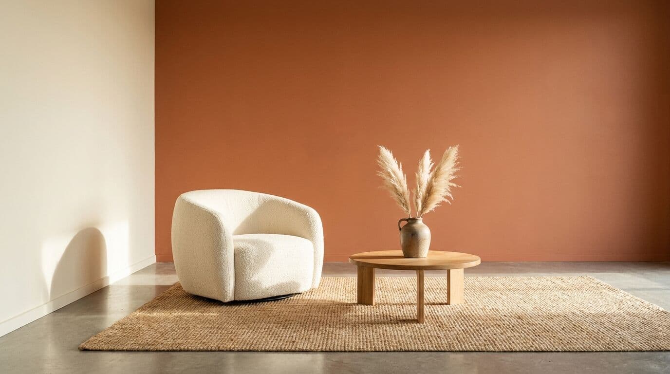
Soft Clay and Terracotta Tones
Terracotta and soft clay colours are appearing everywhere this year. Not the orange terracotta of a 1970s bathroom, but sophisticated, muted versions. Dusty pinks, warm clay, and soft rust tones that add warmth without overwhelming a room.
I have been using these in dining rooms and bedrooms across Blayney and Orange with great results. They pair beautifully with the warm neutrals on adjacent walls, creating a layered, cohesive feel through the home. If you are thinking about selling in the next few years, these colours are a smart choice. They feel current without being so bold that they put buyers off.
A word of caution with terracotta tones, though. Cheap paint in these pigments can look chalky and flat after six months. I always use Dulux Wash and Wear for interior walls in these colours because the finish stays consistent and it cleans up well. In a family home, that matters.
The Colours I Am Telling People to Avoid
Not every trend suits every home, and not every trend lasts. Here is what I am steering clients away from in 2026:
- Pure brilliant white on every wall. It looks clinical, it shows every mark, and in the harsh Central West sunlight it can be genuinely uncomfortable to sit in. A warm white does everything a brilliant white does but without the harshness.
- Very dark charcoals on all four walls. A dark feature wall works. Four dark walls in a room that already loses light to verandahs or south-facing windows will make the space feel like a cave. This is especially common in older homes around Bathurst and Orange where rooms are not always generously sized.
- Trendy pastels without testing them in your actual light. A colour that looks lovely on a Dulux colour chip under fluorescent light at the hardware store can look completely different on your wall at 3pm with western sun pouring through. Always get a sample pot and paint a 300mm square on the wall. Live with it for a few days before committing.
How Colour Interacts with Our Climate
One thing most online colour guides miss is how much local climate affects your colour choice. Here in the Central West, we deal with frost for five to eight months of the year and summer temperatures past 35 degrees. That means homes cycle through significant temperature swings, and the light quality changes dramatically between seasons.
In winter, our light is low and golden. Warm colours look their absolute best. Cool greys can look blue and cold. In summer, the UV intensity at this altitude is genuinely fierce. Bright or saturated colours can look washed out and faded faster than they would at sea level. That is why the warm, mid-tone neutrals and deep natural colours trending this year are so well suited to our area. They look good in every season.
I also recommend higher-quality paint for interior walls exposed to direct sunlight. The UV resistance in premium Dulux products makes a real difference over three to five years. A room that gets afternoon western sun, common in homes across Orange and the surrounding villages, will show colour fade faster with a budget paint. Spending an extra $15 to $25 per litre on a quality product saves you repainting two years sooner than you should need to.
Preparation Matters More Than Colour Choice
I have said this for fifty years and I will keep saying it. The best colour in the world will look terrible if the preparation is wrong. Before any colour goes on, the walls need to be clean, free of flaking paint, properly filled, sanded, and primed where necessary. In older homes around Carcoar and Millthorpe, you might be dealing with multiple layers of old paint, hairline cracks from settlement, or patches of damp that need addressing before a brush goes near the wall.
Every job my team does is owner-supervised. I am on site, checking surfaces, making sure the prep is right, and ensuring the colour looks the way you expected it to. Too many painters rush through preparation to get to the visible work. That is when you end up with peeling, bubbling, and uneven coverage within twelve months.
A full interior repaint for a three-bedroom home in Orange typically takes three to five days when done properly. That includes washing, sanding, filling, priming where needed, two coats of your chosen colour, and cutting in around all the trim. Expect to invest between $4,000 and $8,000 depending on the size of the home and the condition of the existing surfaces. It is not cheap, but a properly prepared and painted interior will last eight to ten years before it needs attention again.
Making Your Colour Decision
If you are feeling overwhelmed by the options, here is a simple approach that works for most homes in the Central West:
- Choose a warm neutral for your main living areas, hallways, and ceilings. This gives you a cohesive base throughout the home.
- Pick one or two feature colours from the deep green, clay, or warm stone palette for bedrooms, a study, or a dining room.
- Use a quality ceiling white like Dulux Ceiling White with a flat finish to keep ceilings crisp and reflective.
- Keep your trim, skirting, and doors in a warm white semi-gloss that ties back to your wall colour rather than fighting it.
This formula is timeless. It works whether your home is a new build on the edge of Orange, a renovated cottage in Millthorpe, or a federation home in Bathurst. The specific shades might change year to year, but the principle of warm, natural, and grounded will carry you through the next decade without looking dated.
If you are planning an interior repaint and want advice on colours that will work in your home, get in touch with Murrays Painting for a free quote. I am happy to come out, look at your rooms in their natural light, and help you make a decision you will be happy with for years. We work right across the Central West, from Orange and Bathurst to Blayney, Millthorpe, and Carcoar.